
 Two words: responsive design.
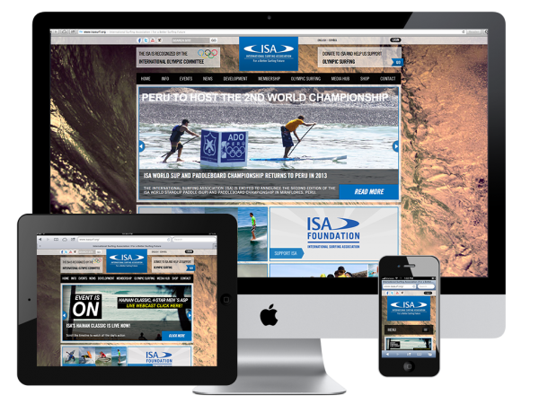
Instead of having a main website AND a mobile website to keep updated, responsive design allows your main website to be “responsive” to various screen sizes such as iPad, Nook, smart phone, etc.
Responsive design does not simply mean to respond by shrinking, it means that your content actually wiggles into a logical vertical arrangement so that the person viewing can scroll larger bits of content and still get the experience you intended your website to give them. Some content may even be omitted if irrelevant for someone surfing the web on their mobile device.
Responsive design also makes the website navigation more efficient by having a simple menu tab that opens up vertically instead of shrunk to fit horizontally. The best way to universally describe this is to compare it to your mobile Facebook menu by locating the top left button with three lines.
The magical part is this all happens automatically with specifically designed views for each screen size. This means the view for an iPad may even contain various full size interactive components that look more like the main website than the mobile view.
Responsive design just may be the best thing since sliced bread.