
What it is…
It’s web design that’s, well, responsive. That means content or image containers wiggle around in a predetermined manner depending on the screen size. Blocks of content and images re-size, stack and sometimes convert in order to give the best possible user experience for that screen size.
Here’s an example of how navigation can shift to become more userfriendly on a mobile device.

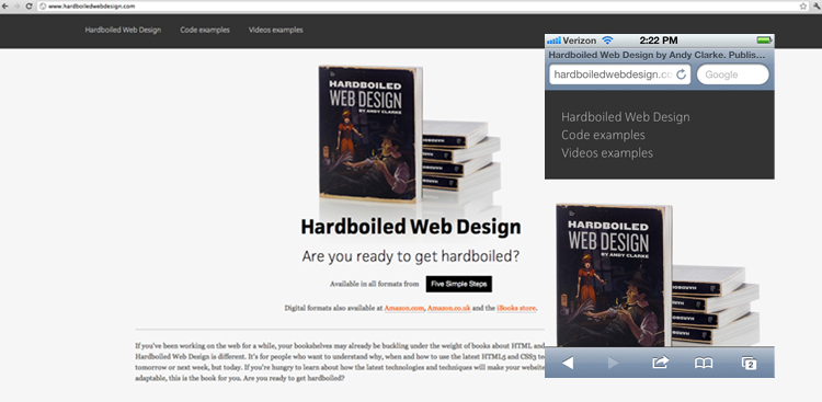
This example also shows a shift in navigation, but also how content blocks can stack and become considerably more readable on a mobile device versus the website simply shrinking.

You need this if…
You have a website of any kind. Mobile phone Web browsing only continues to rise so why not make it easy on your viewers to find the information you want them to find on the go.
Heck you can even tailor what content is displayed on a mobile device… give them the nuts and bolts they need for the mobile experience and save the lengthy bios and such for the desktop browsing experience. How fancy, right?!

